Lane's Construction Services
Proposal
Lane’s Construction Services LLC. is a new residential general contracting and excavation company that approached me
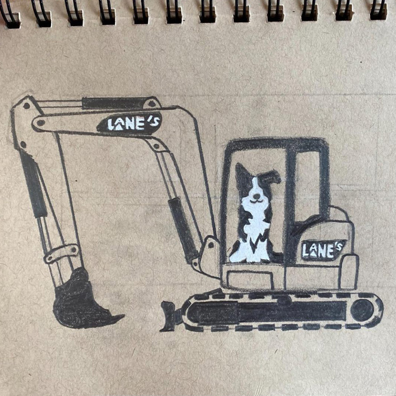
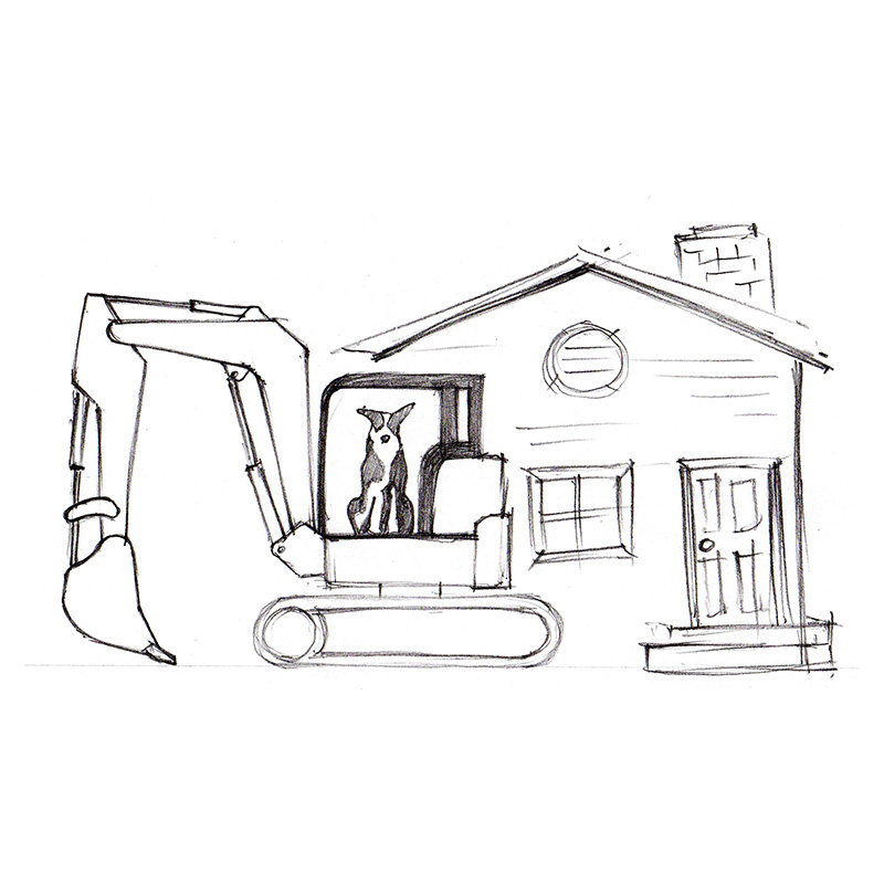
to create their company’s brand identity. When I was initially approached the owner already had a basic sketch of
the logo he wanted to create. The logo consisted of a dog sitting in the cabin of an excavator, and I was asked to
add an illustration of a house behind the excavator.
After our initial conversation it was clear that the scope of the project was actually larger than initially
expected, and required a lot of careful consideration. The company is named after the owner’s dog, so the inclusion
of a dog in the logo was the most important aspect. Including an excavator is very representative of the business’
current focus, but the home represents the company’s long term goals. The challenge was fitting all of these different
aspects in one compact and effective logo.
Developement
Rough 1
To start this project I did a quick sketch of exactly what the client described to me. I explained to him that the
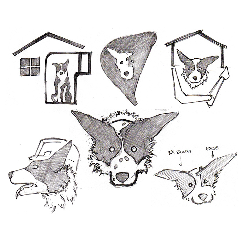
illustration was much too large to be considered a “logo”, he understood and happily agreed. I then continued to
sketch and explore options that contained many of the same elements, but in a more concise format. During this
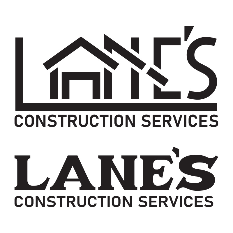
process I came up with the idea to incorporate a house into the company’s name by using the form of the letter “A”.
The client was very happy with the incorporation of a house in the name, but wanted to make sure the letters were
still easy to distinguish and read. He also really liked the slanted script lettering, so I continued to refine both
of these styles in the next round of concepts. Although my client was very happy with the different custom-type in
the company’s name, none of the dog logos caught his eye quite like the original dog logo he sent me for
inspiration.
Rough 2
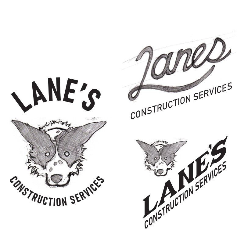
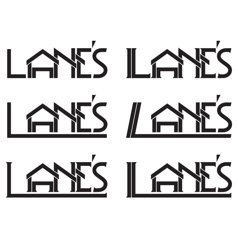
In this round of concepts I really focused on refining the letters in the company name to find a balance between an
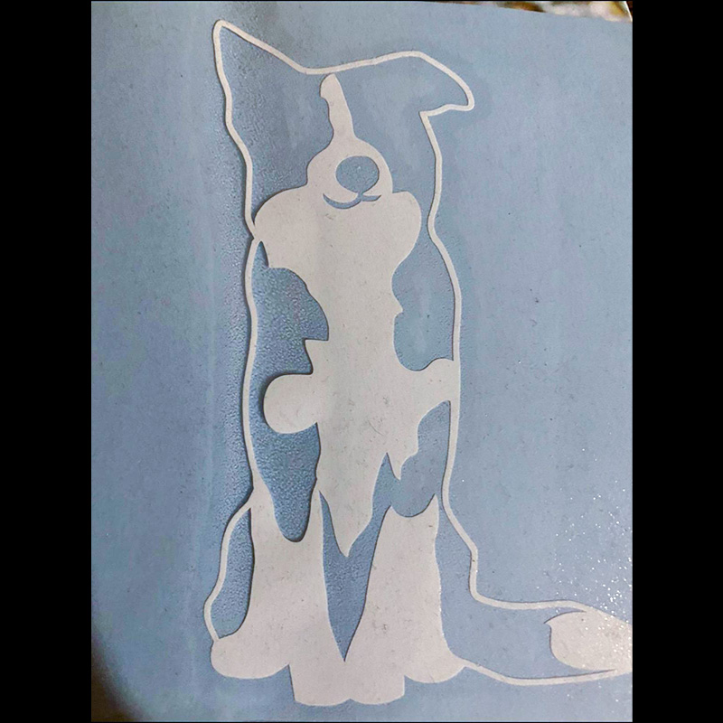
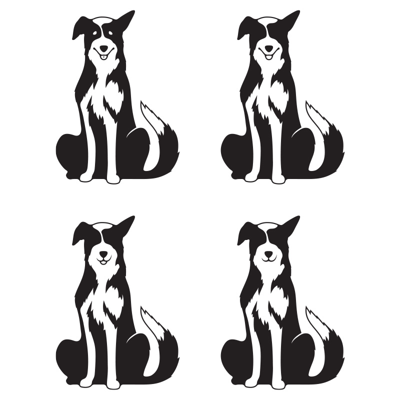
illustration and legible type. I also really focused on the dog illustration to bring it closer to the original
source image, while also maintaining my own style. After I was pretty satisfied with these two elements of the logo
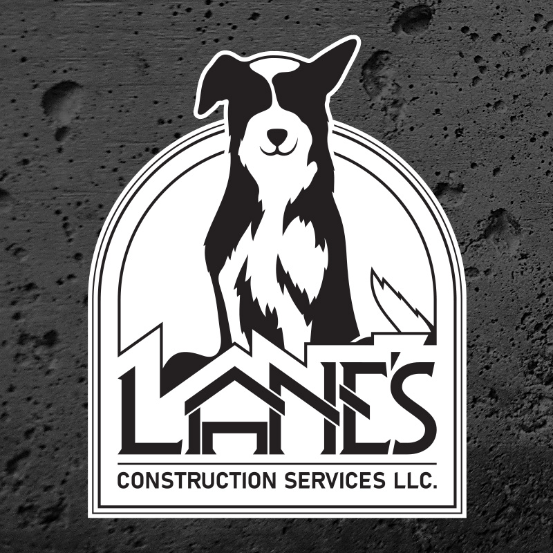
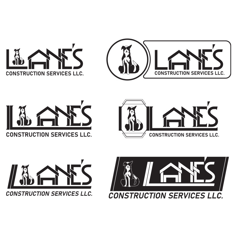
I started to explore different arrangements that would tie them together in a single package.
My client was so happy with this set of concepts that he basically wanted everything. After some in depth
conversation we were able to narrow the grouping down to the features he really liked, and I was able to establish a
visual language that is consistent throughout each of the branding assets.
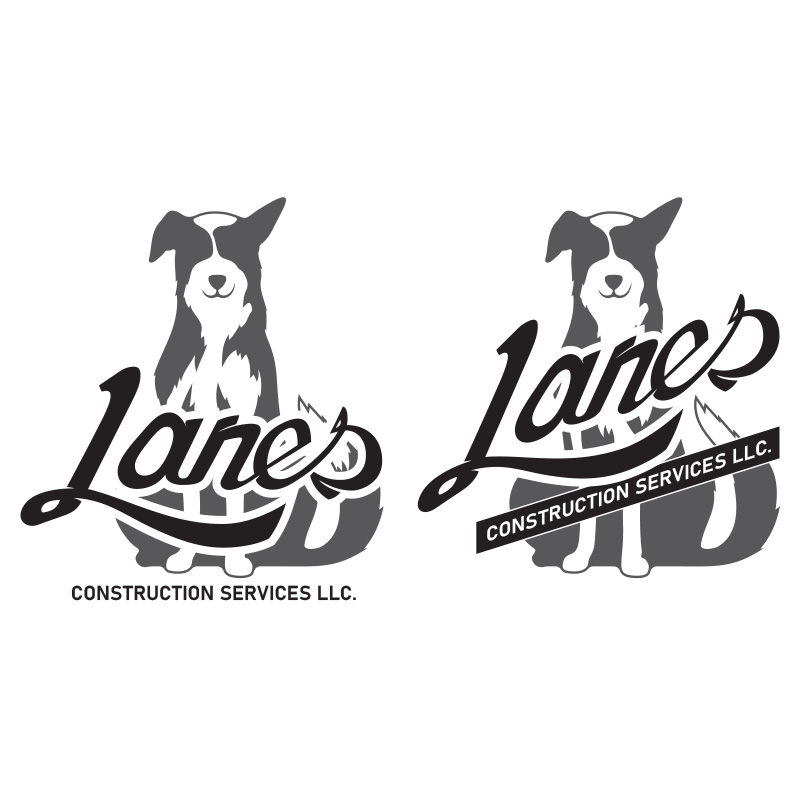
Final
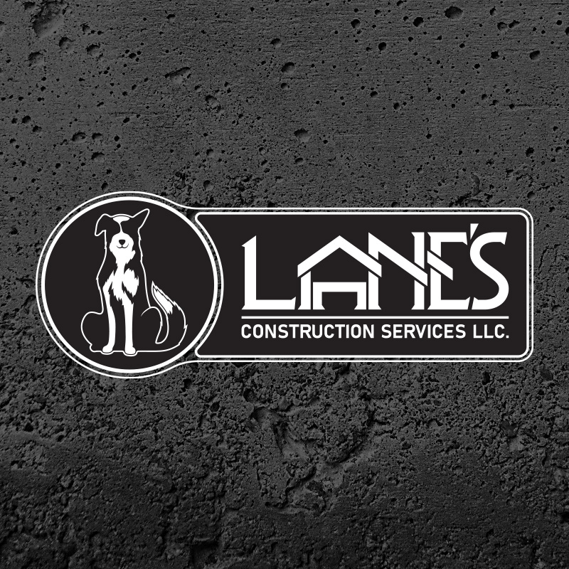
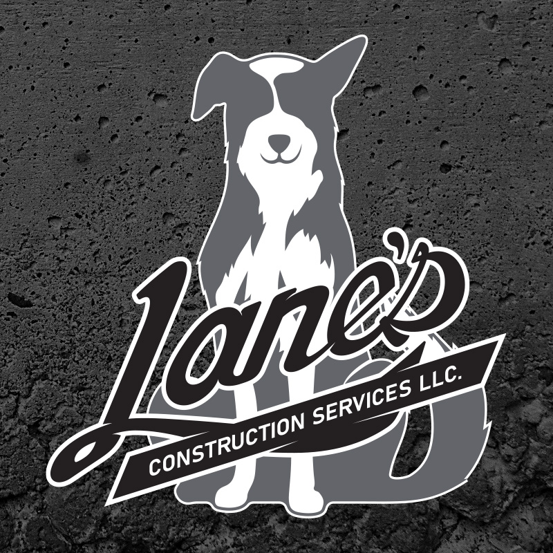
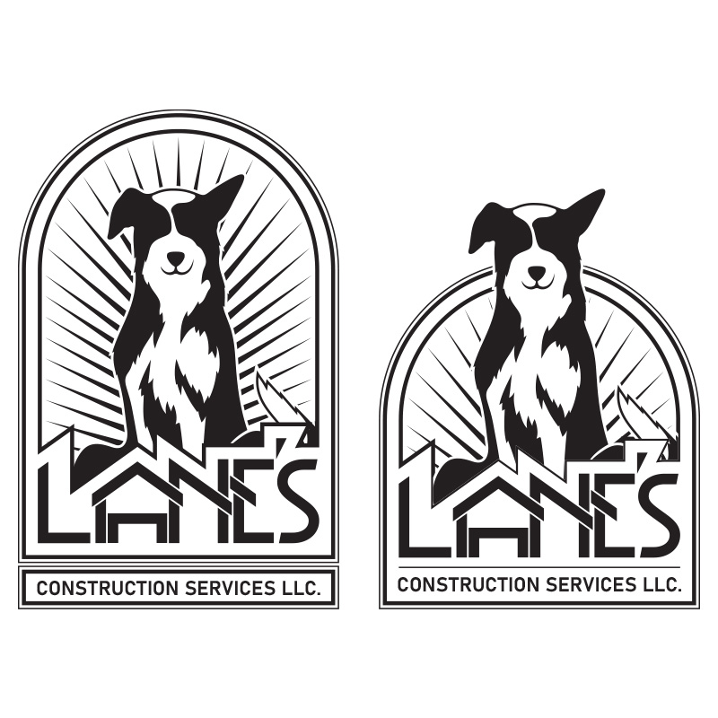
This is the final group of logos I created for my client’s branding package, each one also has an alternate color
scheme so they can be used on light or dark backgrounds. After the previous round of concepts I really took the time
to fine tune every last detail of these logos.
My client was an absolute pleasure to work with, and I’m excited to continue working with him in the future as his
company grows. This project has given me a great opportunity to grow personally as a designer and I’m extremely
happy with the final product I was able to create.